Spark's Android debut was a welcome addition to the Play Store's diverse list of email clients. This app which is generally regarded as one of the best email clients for iOS users brings almost the same set of features to the Android world and it is amazing.
Contents1. Set up an account2. Smart Inbox3. Adjust the sidebar4. Edit gestures5. Add an access key6. Add multiple signatures7. Enable Widget8. Schedule emails9. Repeat emails10. Search intelligently11. Two is a teamTake back control of your inbox
However, if you've recently switched to Spark (or plan to switch soon), you need to know every ins and out of this email client to get the most out of it. From email grouping to widgets, there are over a dozen settings you can play around with (which will probably surprise you).
Download Spark for Android
So, in this article, we have listed some of the best Spark email client settings, tips and tricks. But before we get started, let's take a quick look at its setup process.
If you have a Google account, setting it up is a breeze. All you have to do is select your email account and grant all the required permissions. Press Enter Spark, and that's about it.
At the same time, remember to check the Google security email. It will help you in the long run.


Fortunately, setting up a non-Google account is also the same. All you have to do is enter the username, password and grant the necessary access.
By default, Spark's Smart Inbox organizes all your emails into folders. Relevant emails are displayed at the top, followed by less important emails. You can even read emails in clusters by tapping the tick icon at the top.

But what I liked about this feature is that it's not set in stone, meaning you can tweak and customize it to your liking. To do this, go to Settings> Personalization.
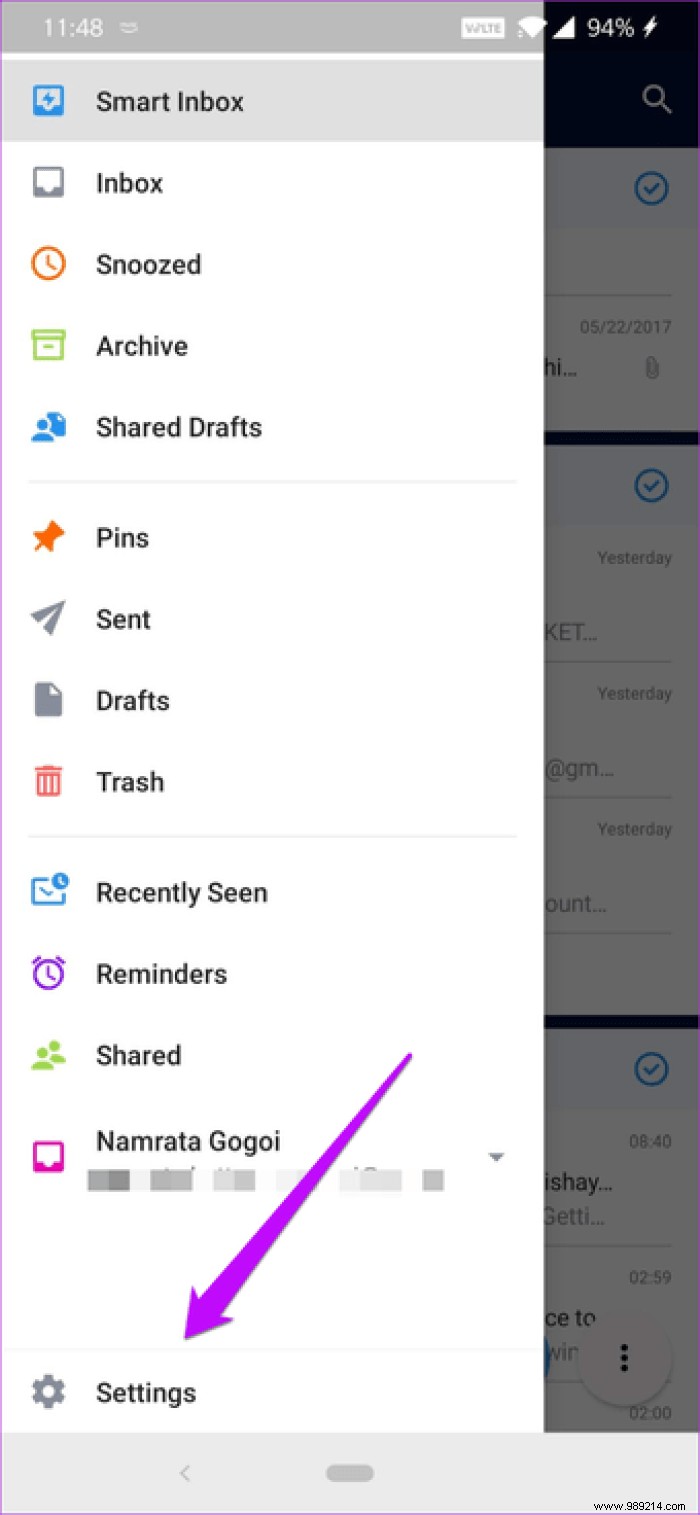

Next, tap on Smart Inbox and uncheck the boxes you don't want to see.
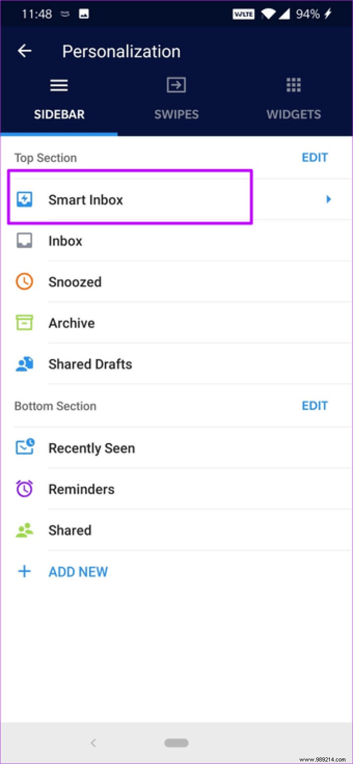

Alternatively, you can tap options to change map settings.
Spark's main strength is its customization features, and that's what makes this email client truly unique.
But perhaps one of the main features of this app is its customizable sidebar (left menu). Not only can you rearrange the options inside, but you can also add your frequently used section there.
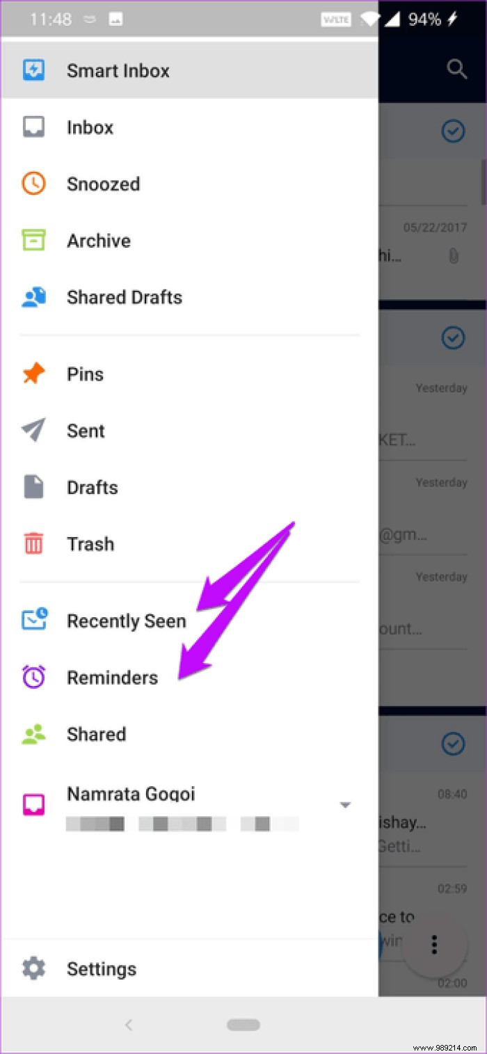
All you have to do is tap Personalization> Sidebar and tap Edit in the Top section.

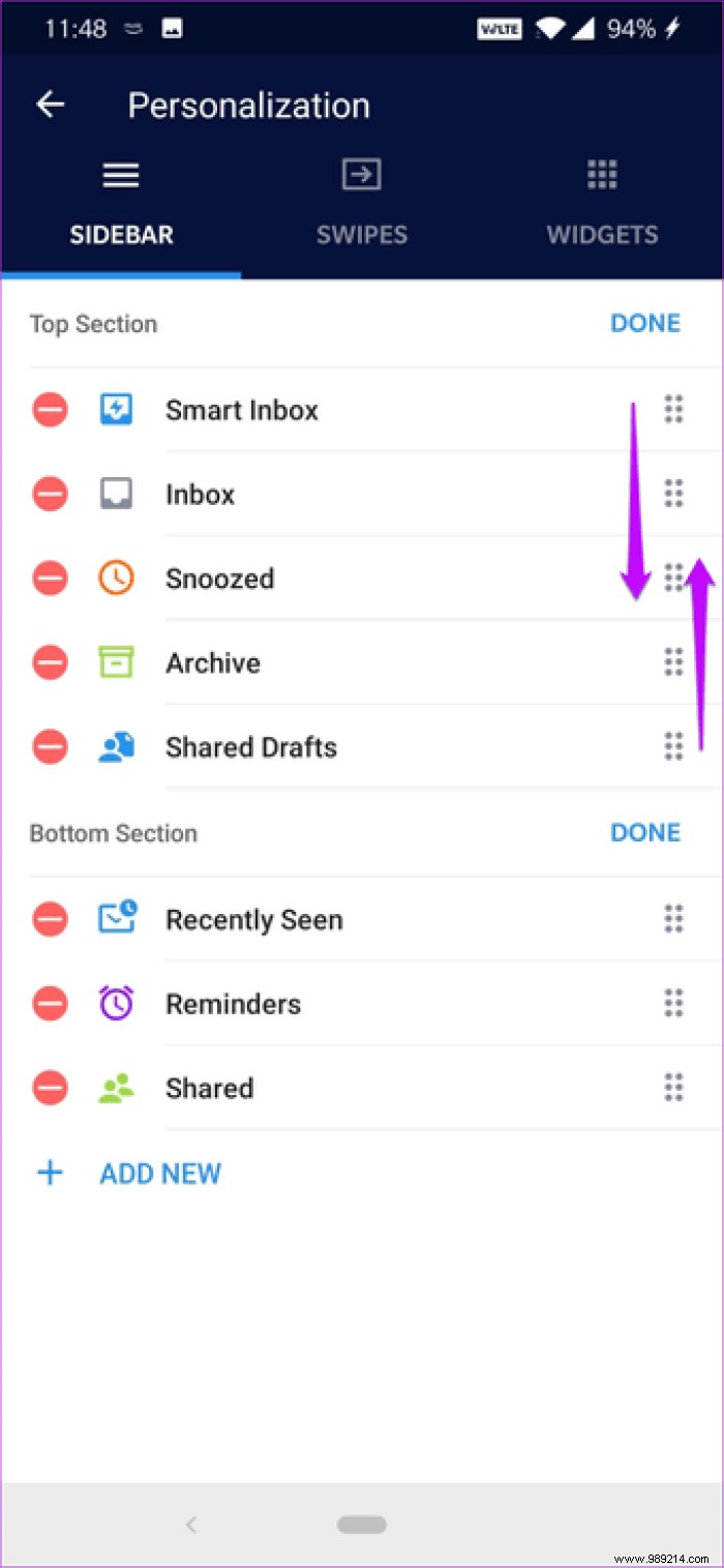
To remove a card, tap the small red icon. Or, you can rearrange the cards by dragging at the end of each card.
By default, a left swipe on an email means Read while a long left swipe means Archive. Similarly, a short swipe right means Pin and a long swipe right means Unpin. The good news is that all four swipes are mappable to an action of your choice.

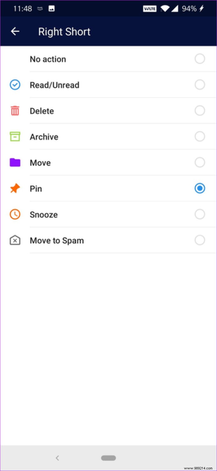
Just head to the personalization section and hit Swipes.
Cool tip :Spark automatically truncates long emails. To read the entire email, just tap View History, and the rest will be taken care of by the app.Don't want your messaging app easily accessible? Easy. Activate the password. As you might have guessed, it will ask you for a password every time you (or someone else) opens the app.

If you deal with sensitive emails on a daily basis, this is one of the first things to do. Additionally, you can also explore the biometrics option.
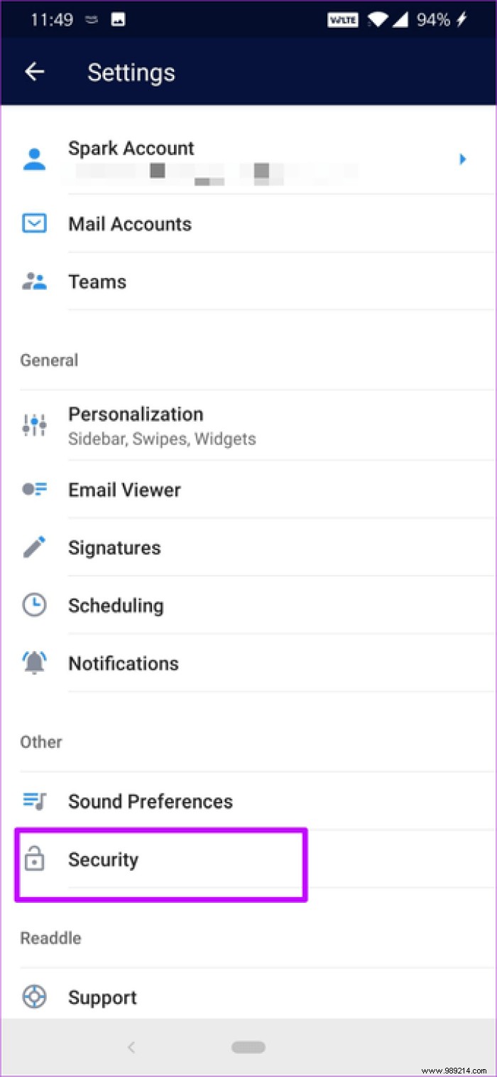
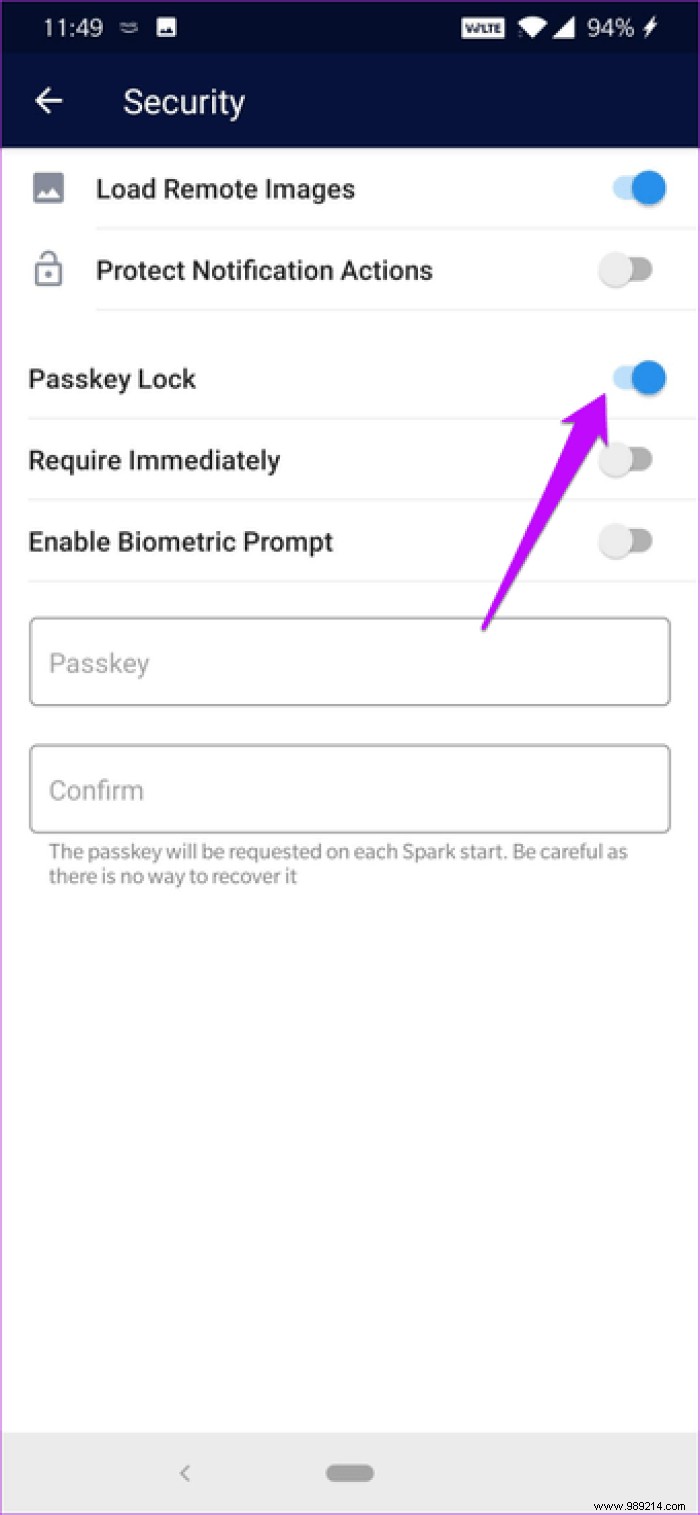
To enable this option, open the sidebar and tap Settings> Security, then enable the Key lock option.
One of the best features of Spark is that it allows you to switch between multiple signatures on your emails. Just tap the signature area and you're done! All pre-added signatures will appear.
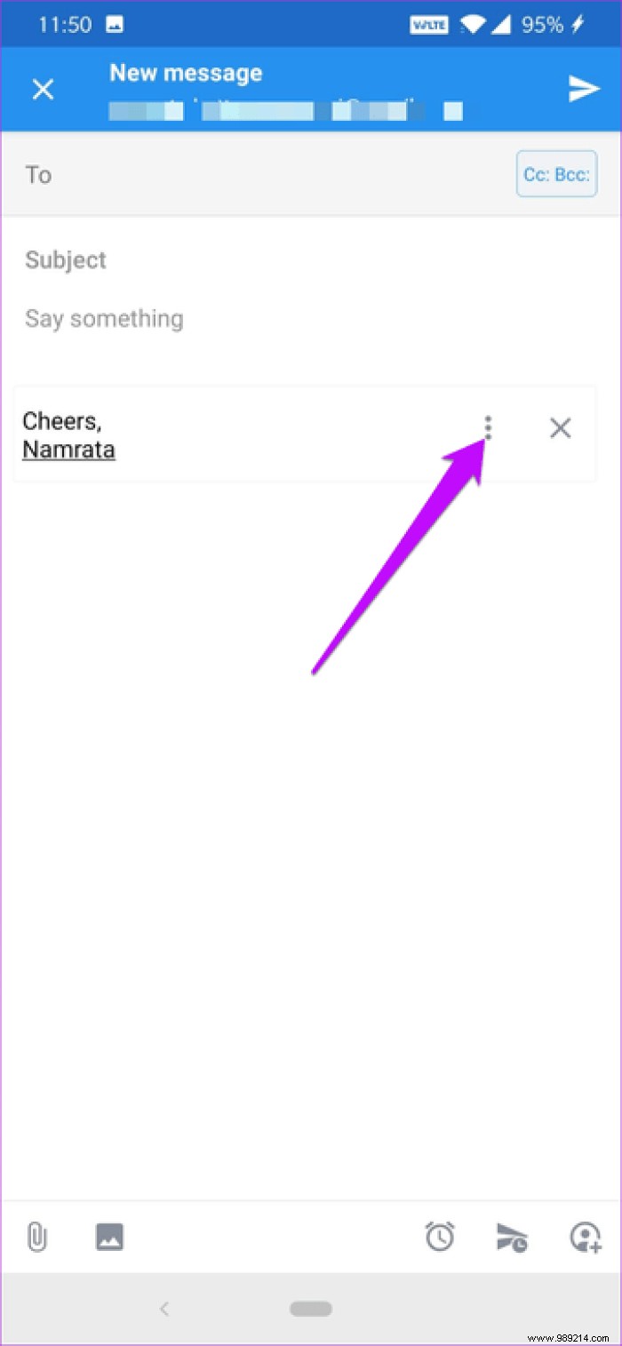

To enter new signature styles, open Settings> Signature and add the new signature. Tap Add signature to add new ones.

Although the default format is text, you can also use HTML codes for links and images. To edit a pre-added signature, tap the name to make your changes.
Spark Mail also lets you add a widget (a floating button) to the bottom of the inbox, after which you can customize it to your needs. For example, you can either schedule it to retrieve your recently read emails or your next reminders.
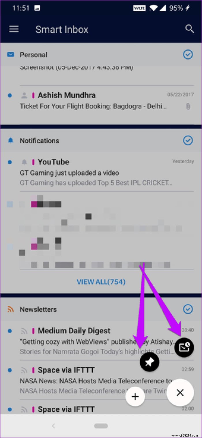
To configure the widget, go to Settings> Personalization> Widgets and choose its position. You can have it in the middle of the screen (four actions) or in the lower right corner (two actions).


To add a new action, press the Add widget button and select the action. To test it, go to Spark's home screen and tap the three-dot button. All the actions you just added will appear immediately.
Are you someone who emails at 2am? If so, it's time you got started with Spark's scheduling feature.
As the name suggests, lets you schedule emails for a later date. And the best part is that the timing is changeable as per your convenience. So, 'Later today' may mean +3 hours for you while it may mean +2 hours for me.
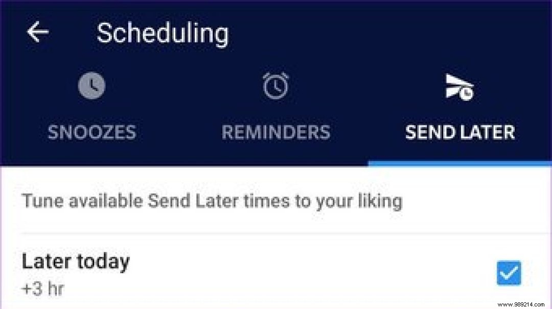
For now, Spark offers a variety of scheduling options. You can choose from a multitude of options like Evening, Tomorrow, Weekend, Next week, etc.
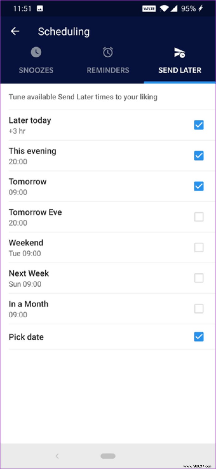
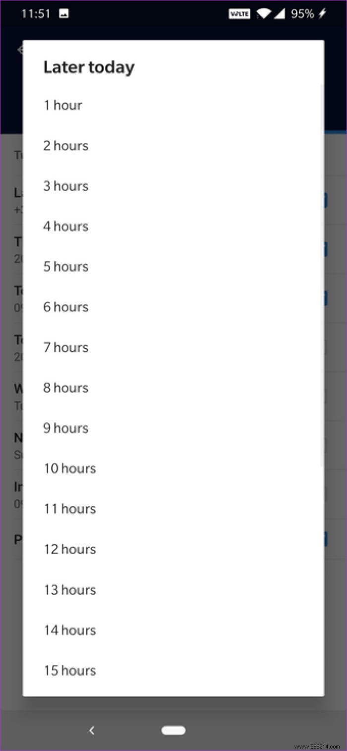
Similar to the other changes above, schedule settings are found under Settings. Just be sure to make the changes under Send Later (third tab).
Another cool and customizable feature is Snooze Email, using which you can return to an email at a later time. Well, it's in almost every email client, so what's great about Spark?

Well, Spark lets you change snooze times. So if you choose Later Today as your snooze option, you can choose what time the app should notify you again. Plus, snooze notifications sync across all devices.


You can find repeat settings under Settings. To snooze an email, long press it and choose Snooze from the top bar. Select the time and the app will do the rest.
Searching for PDFs, documents, and even images in Spark is a breeze. This application is known to handle natural language as easily as it handles specific keywords.

So if you are looking for a PDF or Word document, just type the text in the search bar and the matching emails will appear immediately.
Cool tip :You can also add a star to a frequently consulted term.Finally, let's talk about Teams, Spark's most interesting feature. This allows team members to collaborate on emails just like you would on Google Docs. Additionally, you can discuss a draft email among members before it is sent.
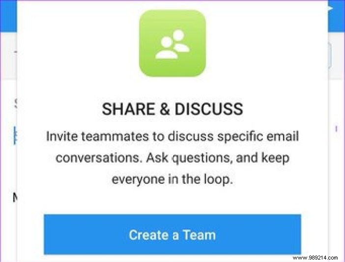
To start experimenting, you must first form a team. To do this, go to Settings> Teams and tap on Create team. Now add the team name and members.
To discuss an email, open one and tap the Add People icon in the lower right corner. Similarly, to discuss a draft, tap the Add people icon. Either way, you'll see a thread at the bottom of the thread.


The downside of this wonderful feature is that both users must have Spark Mail installed.
Going through hundreds of emails in a day can be an overwhelming chore. Yes, processing emails is not a simple game then it is meant to be. Luckily, there are a few email clients that meet this challenge and Readdle's Spark is one of those apps.
The good thing about this messaging app is that practically everything can be customized according to your choice. Plus, all settings, reminders, and schedules can be synced across your systems. The only thing missing is a dark mode, which we hope manufacturers will introduce soon.
Next step:Are your attachments too big to fit in one email? Check out the following post for some tools for that.