Chrome on iOS is greatly reduced. Apart from the cross-platform synchronization features it brings, Google's browser is quite limited in terms of customization. Compared to Safari, even the theme Chrome uses leaves a lot to be desired – in fact, it looks quite dated and boring.
ContentsActivation of the themeSo, what has changed?On the iPadSo what are you waiting for?
But not anymore. A recent update to Chrome for iOS brought a host of drastic design changes, and if you hate the current browser theme, the new UI should be welcome. Looks like the much-talked-about Material Design changes are finally here on iOS. Phew.
However, Google hasn't really made the new UI the standard default on Chrome, so you have to manually enable it with a minor tweak in the browser's experimental settings panel.
So let's go ahead and ditch the current theme for good.
The new Material Design UI, dubbed "UI Refresh Phase 1", is only available on Chrome version 68 (or higher) for iOS. So be sure to update your browser to the latest version via the App Store before proceeding.
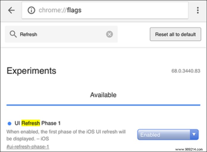
To get started, go to Chrome's experimental settings panel. To do this, type chrome://flags in the URL bar of a new tab, then press Enter.
On the Chrome Experimental Features screen, type Refresh in the search field. You should see an option labeled User Interface Refresh Phase 1 appear at the top of the screen. Use the drop-down menu next to it and select Enabled.
 Note: You may actually see the Chrome indicator listed with a different phase version number during subsequent browser updates.
 To apply the changes, you need to force quit the app:just double tap the Home button and swipe the Chrome app card up. On the iPhone X, however, you need to swipe up from the bottom of the screen to access the app switcher, then briefly press and hold the Chrome app card. Next, tap on the red color icon.
Once you've force quit Chrome, simply relaunch it to experience the browser in all its newfound glory.
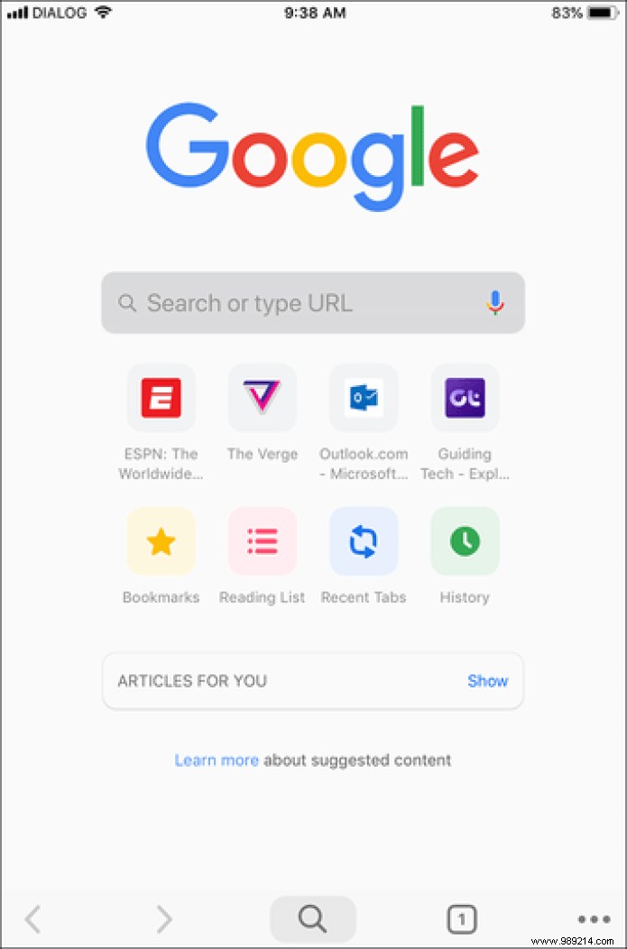
Looks very different now, doesn't it?
As you can see, a ton of things have changed. The rounded curves of the search bar, buttons and icons are immediately noticeable, which now look quite modern, much larger and more pronounced. Even the colors are no longer dull or dull, and they really pop when you open a new tab for the first time.
You may also see a bunch of new icons labeled Bookmarks, Reading List, Recent Tabs, and History listed just below your Frequented Sites list. It should be very convenient to get to those places much faster.

Next, you should see huge changes to the navigation options, which are now listed at the bottom of the screen. Although the URL bar is always at the top, the ability to go back or forward without having to stretch your thumb all the way up is refreshing.

Also, the position of the URL bar doesn't matter either. You no longer need to tap it to start searching – just use the new search icon and you're good to go. It was always uncomfortable having to use the URL bar, especially when you've already loaded a site, which is why this new addition to Chrome is a major improvement.
Even switching between tabs is easier – the numbered icon that brings up the tab switcher is now comfortably present in the lower right corner of the browser. Better yet, tap it to open your tabs as thumbnails – much reminiscent of the iOS app switcher itself – instead of the usual drawer, making it easier to locate and select the tab you want. /P> 
From the tab switcher, you can now instantly switch to incognito mode with a left swipe, while checking your list of synced devices involves a right swipe.
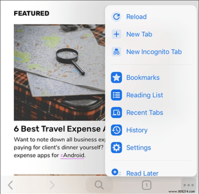
What about the Chrome menu? Well, it also got a visual overhaul. You should see the items inside now displayed in a bluish color, with relevant icons next to each ad. And just like the tab switch, its location on the bottom edge of the screen makes it easy to open.
Unfortunately, the Settings panel is still the same boring list of options that was present before, which is understandable since the UI update has yet to become mainstream. Also, expect some other elements such as the History pane and Bookmarks to look and function the same.
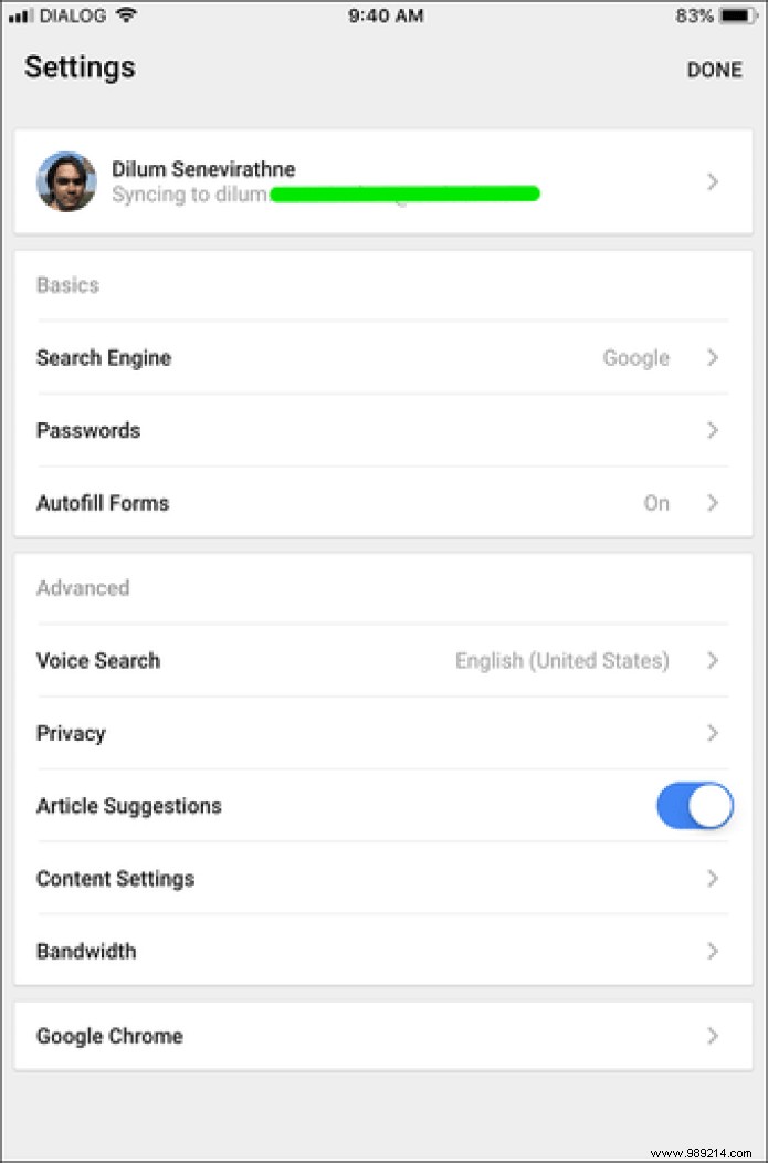
In a nutshell, anything not visible at first glance is likely to look like the default Chrome theme.
If you're using an iPad, you can switch to the new UI by following the same procedure. And from a basic point of view, the changes seem even more significant due to the presence of the desktop-shaped tabs, which now sport rounded edges.
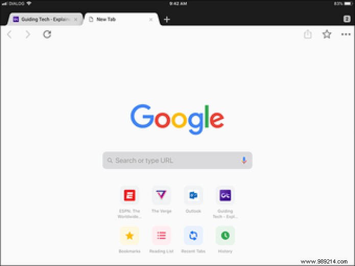
But other than that, you're unlikely to find any navigational improvements – unless you're using Chrome in split view mode, in which case the search and switch tab icons move to the bottom of the screen , like on iPhone.
Thanks to the new design update, Chrome looks better and works better than ever. The navigation and search options at the bottom of the screen alone make a huge difference and should make for faster searching and tab switching.
However, keep in mind that the entire design is still in the experimental phase. Sometimes you may notice some anomalies where some web elements are not displaying properly. If this is preventing you from browsing normally, consider reverting to the default theme until Google fixes the bugs on it.