If you've upgraded your computer from Windows 10 to Windows 11, you may find that your taskbar isn't as configurable – and perhaps not as useful – as previously. For example, the familiar old Start menu with its configurable Live Tiles is now gone. The search box is no longer in the taskbar but can be accessed by first clicking on the Start menu – an extra step. (Although the fact that Cortana is no longer automatically part of this search box might be considered, at least by many, a plus.)
ContentsPin an application to the taskbarRemove an application from the taskbarMove your icons to the leftTaskbar corner icons and overflowAnother thing:the taskbar is now permanently pinned to the bottom of the screen – so if you were more comfortable having it at the top of the screen, or either side, you're out of luck.
As you can imagine, Windows users are already releasing fixes for at least some of these issues, as long as you're comfortable tweaking your Windows Registry. For example, there's one that supposedly lets you move the taskbar to the top of the screen, and another that lets you change the size of the taskbar.
Microsoft may bring back some of these capabilities in future updates to the new operating system. For now, let's focus on how you can adjust the current Windows 11 taskbar.
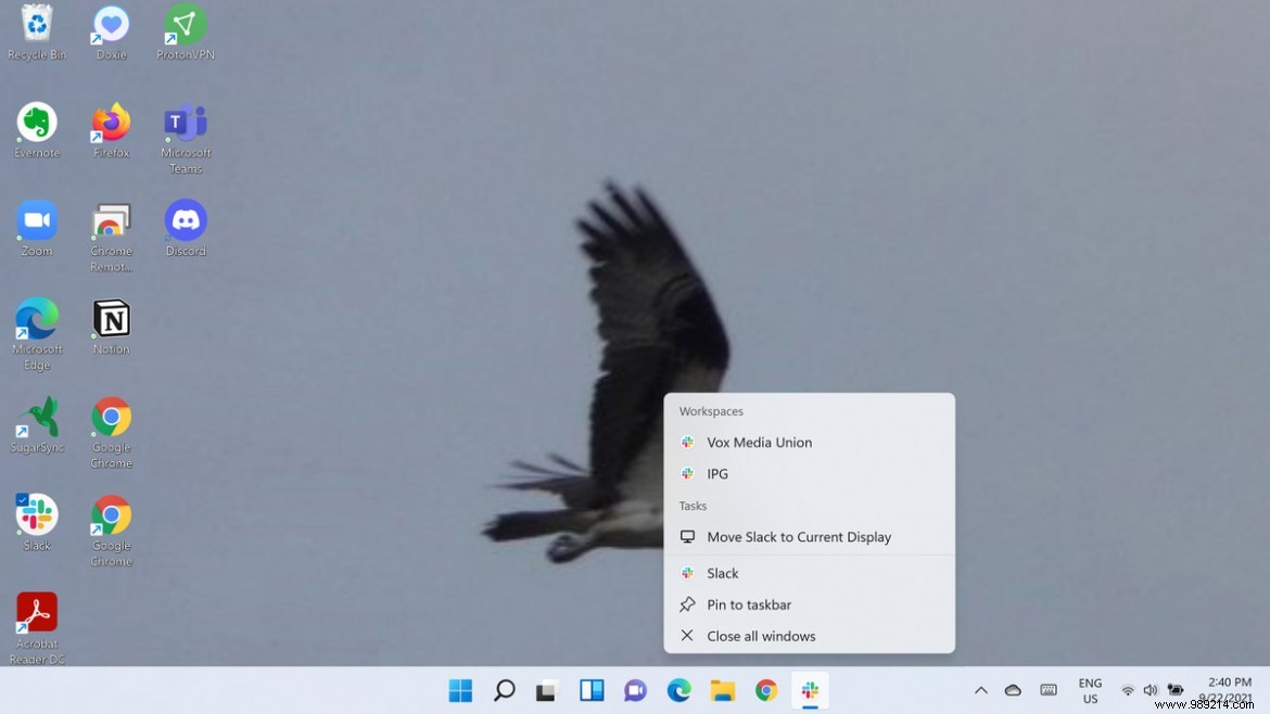
Pinning an app to the taskbar at the bottom can be a bit – well, weird. There are several ways to handle it:


Most apps are simple to remove:right click on the icon and select "Unpin from taskbar".
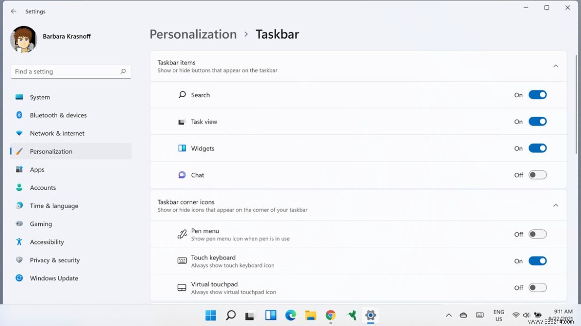
A few of the icons require a bit more effort to remove. The Start menu icon is, as you might expect, unremovable. But there are four other icons that cannot be deleted but can be hidden. The easiest way to do this is:

Those of us who have used Windows 10 (or 7 or earlier) are used to accessing the Start menu from the lower left corner of the screen. If your muscle memory is causing your hand to drift to that corner, you can move the app icons in the center to be on your left instead:

Incidentally, the "Taskbar Behaviors" section of the settings lets you do more than just move your icons to the left. It also allows you to auto-hide the taskbar (which has been a taskbar behavior for a very long time); show a badge on taskbar apps to let you know if, for example, you have unread messages; manage taskbar operation across multiple screens; and show a clean desktop by clicking on the rightmost corner of the taskbar.

Although the taskbar corner icons and overflow window aren't new, I never really knew what they were called before. To tell you the truth, when I first saw the phrase "taskbar corner overflow", I imagined a bunch of app icons popping out of the screen like the falls of the Niagara. Turns out the corner icons are the icons in the right-hand corner of the taskbar — the ones that show the time and date, your battery status, your volume level, and the status of your Wi-Fi, among others. Overflow is the little context menu that appears when you select the arrow to the left of these corner icons.
For the most part, the overflow window icons are meant to alert you when there's something to do - messages that have arrived or an update that's needed. It's also handy for apps, like Discord, that tend to run in the background; you can easily close them from the overflow by right-clicking the icon and finding the "Exit" selection.
Although most of the corner icons that ship with Windows are permanent, some, especially the pen menu, touch keyboard, and virtual touchpad, can be hidden. They can be found in the same taskbar settings menu that allows us to move icons to the left; just click on "Taskbar corner icons" and turn off the ones you don't want to see.
