If you've recently logged onto the Netflix website to watch a new show, you might have noticed things are a little different. That's because after years of a boring, slow design, Netflix has finally updated the website to be modern and fast. Everything is darker, the navigation isn't the same, and some features are in different places.
It's by no means difficult, but you might want a quick and easy guide to navigating Netflix's new website. If so, you have come to the right article. Here are some tips to get you started with Netflix's redesign.
Arguably the most anticipated feature for a Netflix redesign was better navigation that removed the endless horizontal scrolling of titles. Previously, you had to hover your mouse left or right of any row and wait for the carousel to move slowly and new titles to appear.

On the updated website, all you have to do is click the arrows to quickly drag in a whole new row – no hovering or waiting necessary. The same functionality applies to the Continue Watching and My List views, as well as browsing through episodes and seasons. More on that in a moment.
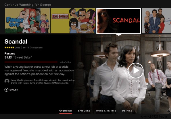
On the previous version of the Netflix website, to see information about a particular show or movie, you had to hover your mouse over the thumbnail and wait for a pop-up to appear with a little detail blurb. It was boring and not particularly touchscreen friendly.

With the redesign, this has been replaced. You can still hover over the tiles to reveal the title and the particular episode you're on, but now all the show or movie information is buried in a drop-down panel. Click the d possess arrow on a tile to expand all the details. This includes a description of the particular movie, show, or episode, the average rating, tabs to browse for additional content, and the option to add to your list.

You can close the panel and open a new one for a different title by clicking the X. It's especially convenient to take advantage of this, because viewing title details with the previous design required opening a new URL each time.
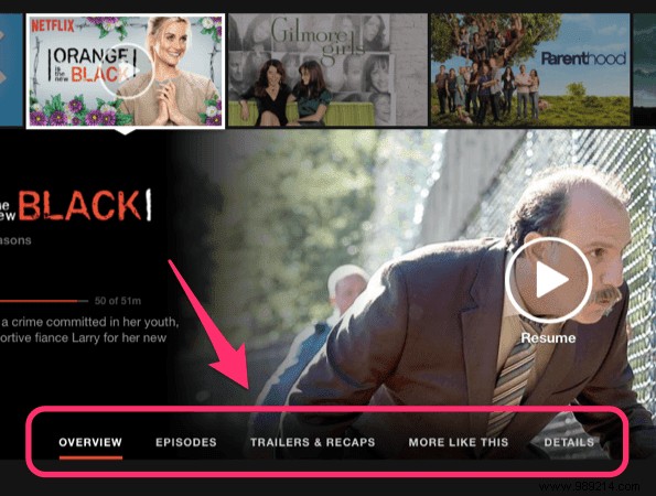
Within each expanded panel are a few different tabs that contain more information. Previously titles had their own URLs with everything you need to know on that page. Now everything lives happily in the new panels. These tabs include "More Like This" to see related titles and details, including runtime and full user reviews.

Tip: On some titles, additional tabs appear. Browsing through seasons and episodes is of course available for TV shows. Also, for some reason, a "Trailers" tab only appears for what appear to be Netflix original shows. Hopefully Netflix will add trailers for more titles in the future.
These are all the major changes in Netflix's new redesign. They are small, but significant in every way to improve the user experience in your web browser.