If you're familiar with the plethora of new features coming to iOS 10, you're probably already familiar with the drastic overhaul of Apple Music just a year after it debuted. It has a new user interface with better navigation and much smarter music recommendations.

That's all fantastic, but sometimes it's the little things that can really add up and contribute to an enjoyable experience. It's worth reviewing some of the new features in Apple Music. Apple may not have pushed so hard during the WWDC 2016 keynote, or simply left it out. Check out these little, but still much-loved bits, coming to iOS 10.
As if the iTunes app on Mac and PC wasn't already messy enough, adding Apple Music to it last year made matters worse. Music imported to your library, purchased from iTunes, and saved from Apple Music were all under one roof and easy to get lost on any device.


Thankfully, with iOS 10 and the Apple Music makeover, Apple has done a much better job of distinctly labeling what music is part of the subscription service and what is iTunes. First of all, downloaded music now has its own prominent section. If you only care about what's on your phone, whether from Apple Music or iTunes, it's available here. You can assume that everything else in your library is Apple Music streaming content.
Apple Music also mixes up Download buttons and Add to Library buttons, which makes everything a little clearer. If you're looking at an album that you've already purchased songs from, you can tell by looking at the Download icon next to it, although you can still stream it from the cloud if you want. If you didn't purchase a song and it's available on Apple Music, you can choose to just add it to your library instead.
3D Touch is getting more love in the Apple Music redesign for two reasons. For one, the Music app has its own widget on the home screen. Touch the 3D icon and you can see your recent albums and playlists for easy access.


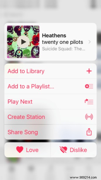
In the app, 3D Touch lets you access song and album options. 3D Touch any content to bring up a menu that lets you view the album, add it to your library, add it to your playlist, play next or play later, create a station based on it or share it. You can also press Like or Dislike to let Apple Music know your tastes.
The Now Playing view in Apple Music now has more features than you might think. At first glance, it looks downright simple, but now you can flick to reveal what's underneath. First, if a song supports lyrics, you can tap Show next to Lyrics to scroll through them.


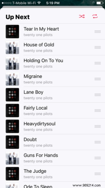
Below is your entire Up Next queue that you can drag and drop to customize it. Gone is the dedicated icon to see what's in the queue – just scroll to see it all.
ALSO SEE: GT Explains:What Is iCloud Music Library and Should You Use It?